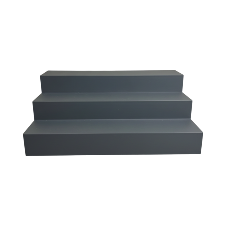
When everything is made to order, colour stops being a constraint and becomes a decision, which is harder. Here is how we think about it when someone asks — and people ask constantly.
Finish matters more than hue
If a piece has any texture, relief or faceting, the finish decides whether you see it.
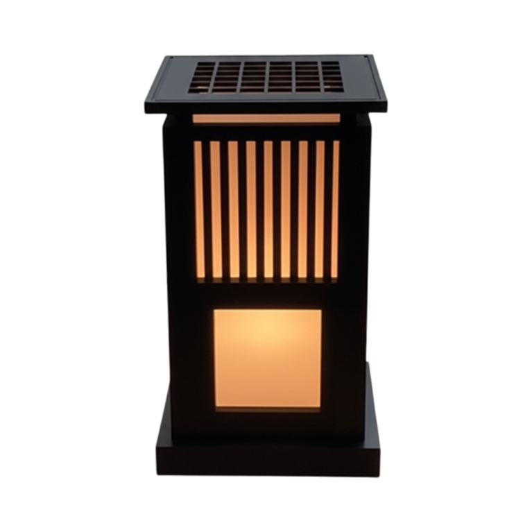
Matte scatters light, so every ridge casts a shadow and every facet reads as a distinct plane. A parametric ripple, a kumiko lattice, a topographic contour or a low-poly surface only works in matte.
Gloss reflects, and a reflection is brighter than any shadow. The result is that a glossy textured surface collapses into a single highlight and you lose the geometry entirely.
The rule: if the shape is the point, choose matte. Gloss is for smooth forms where you want the reflection itself to be the effect.
Disappear, or be the point. Not neither.
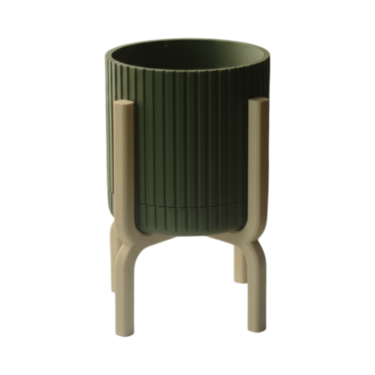
The pieces that look wrong in a room are almost always the ones that tried to be tasteful and ended up neither integrated nor deliberate — a mid-tone grey planter in a beige room, a sage-green shelf next to sage-green walls but not quite the same sage.
Two honest strategies:
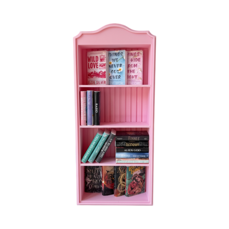
Disappear. Match the wall, the trim or the furniture it sits on as closely as you can, and let the object read as part of the architecture. This is right for shelving, storage, anything functional, and anything you will own for a long time. Send us a photograph and we will match it as closely as our stock allows.
Be the point. Choose a colour nothing else in the room has, and commit. One saturated object in a neutral room reads as intentional. Three do not.
What fails is a near-match. The eye is extremely good at detecting that two things are almost the same colour, and it reads as a mistake.
Where black is the right answer
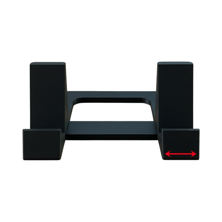
Matte black is the default for anything whose job is to hold something else: display risers, miniature stands, market-stall furniture, cable management, monitor risers.
It recedes. Everything you see is the thing on it. This is why gallery plinths and jewellers’ trays are dark, and it is the single most reliable colour decision in this whole article.
Where white and off-white work
Sculptural pieces, where you want form without colour competing. A matte off-white reads as plaster or unglazed ceramic; a bright pure white reads as plastic, which is the one thing a sculpture cannot afford.
Bone, sand and warm greys are almost always better than pure white for this reason. The warmth is what stops it looking synthetic.
Where colour genuinely helps
- Coding. Storage bins by contents, coasters by person, cable tags by device. Colour used as information is never wrong.
- Children’s rooms, where saturation is the point.
- Small, cheap pieces bought as a set — a run of coasters in graded shades of one colour looks far more considered than the same set in one colour, and costs the same.
- Two-tone, where a pale body on a dark base makes a pot read as furniture rather than as a single object.
Lighting changes everything
A colour chosen under a 4000K shop light will look different under a 2700K lamp at home — warmer, yellower, and a few shades darker. Greys drift toward brown, blues go muddy, and whites go cream.
If you are matching something, match it under the light the object will actually live in, not by a window at noon.
Will you still like it in two years?
The honest test for anything you will own for a long time. Strongly trend-coded colours — the very specific greens and terracottas that turn up in every catalogue for eighteen months — date visibly, and they date all at once.
Neutrals do not. Nor do colours you have liked for a decade already, whatever the catalogues are doing.
For something small and cheap, ignore all of this and buy the colour that pleases you. For a floor planter you will own for ten years, it is worth thirty seconds of thought.
Just ask
Every piece in the catalogue is printed after you order it, so the colour shown in the photographs is a default rather than a limit. If you want something else, or want us to match a photograph of your room, that is a normal request rather than a special one — get in touch and we will tell you honestly what we can match.
The full catalogue is printed to order in Canada.