People have been announcing the death of the business card for fifteen years, and reception desks across the country still have a stack on them. The card did not die; its job changed. It used to be how someone found your phone number. Now it is a physical object that survives a conversation, and that turns out to be a different and still-useful thing.
Why the physical card persists
A card sits in a pocket and resurfaces two weeks later on a kitchen counter, at which point someone remembers a conversation they would otherwise have forgotten. A contact saved in a phone during a noisy event does not resurface; it sinks into a contact list of four hundred names.
It also does something a QR code cannot: it is a small piece of physical evidence that you are a real operation. For trades, studios, clinics, salons and market traders — anyone whose customer is deciding whether to trust them — that matters more than the information printed on it.
What separates a good holder from a bad one
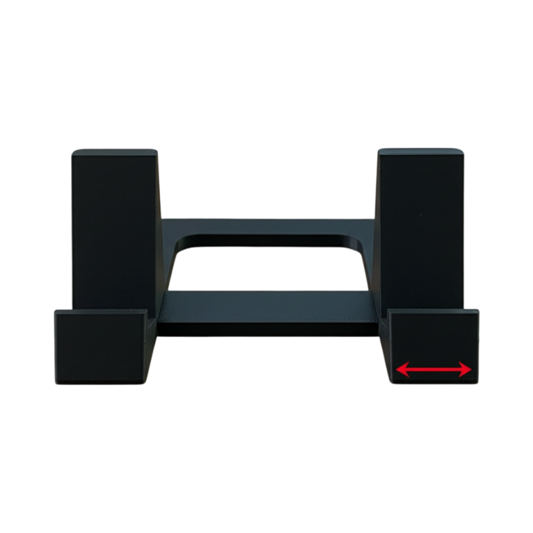
The angle. The top card should be presented face-up and readable, tilted toward the person standing at the desk. A flat stack in a box means the visitor sees the edge of a pile, and has to pick one up to find out whose it is. An angled well does the work for them.
The side it faces. Obvious and constantly got wrong. The holder is for the visitor, not for you. It faces outward.
Weight. Taking a card from a light holder drags the holder across the desk. That is a small, cheap-feeling moment at the exact instant someone is forming an impression. A weighted base fixes it.
Capacity. A full box of cards, without the stack bowing in the middle. A holder that takes twenty means you are refilling it every week and it is empty half the time — and an empty card holder is worse than none.
Thumb relief. A cut-out at the front so one card lifts out cleanly. Without it, people take three cards stuck together, or fumble.
Plain or interesting?
Both are correct, for different situations, and it is worth deciding deliberately.
A plain holder gets out of the way. That is right when the card itself is the designed object, or when the desk should read as clean and professional — a clinic, a law office, a consulting room.
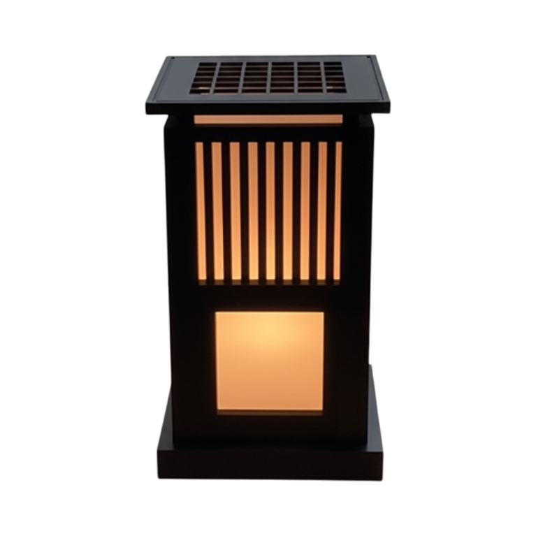
An interesting holder is right when you want the desk to say something before the card does. Our Kumiko version carries a lattice patterned after Japanese joinery — the traditional woodwork fitted together by geometry rather than nails — across the front face, which is the face the visitor sees. For a studio, a workshop or a design practice, that is a better conversation starter than anything printed on card stock.
What to avoid is the middle: something ornamented without a reason, which reads as a desk accessory rather than a decision.
Colour
For the Kumiko lattice, wood tones are the obvious choice and matte black is the better one. Printed plastic imitating timber invites the comparison and loses it; in matte black the lattice reads as pure shadow, which suits a modern desk and does not pretend to be something it is not.
For a plain holder, match it to the desk or contrast it deliberately. Nothing in between.
Where else they earn their place
- Craft fairs and markets — where a card is how someone finds you after the event. Put it at the front edge of the table, not behind the stock.
- Trade shows, where you will go through several hundred and want a holder that takes a full box.
- Consignment corners in a shop stocking your work, where the card does the introducing when you are not there.
- As a gift for someone who has just started something — it is the rare gift that says you take their new venture seriously.
A note for small businesses
If you are ordering for a business rather than a desk, made-to-order changes the maths: no minimum quantity, holders in your own colour, and the option to test one at an event before committing to a dozen. We do this for shops and market traders regularly — the details are on our services page, or just ask.
The desk and tech range is printed to order in Canada.